In Merlin you can change the appearance of your Gantt, columns, styles, etc.
Merlin contains a wide range of columns. A brief description of the contents of each column can be found in the relevant activity, Elements or the resources "View Options" dialogue.
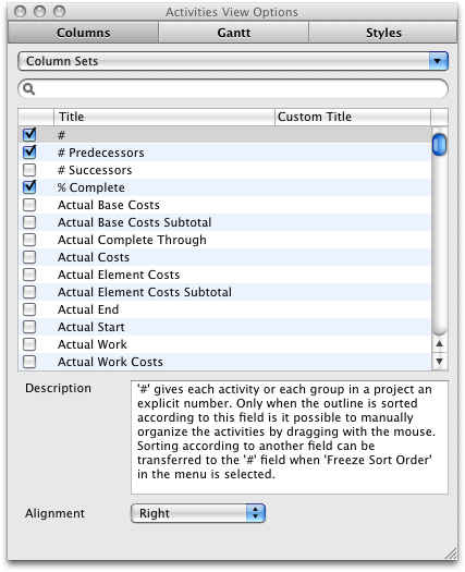
Although you can right click on a the column header to see a listing of all the possible columns you can show/hide, when wanting to enable more than one columns you will find it easier to do this in the View Options dialogue.
- Select the View you wish to change (Activities, Netplan, Resources, or Utilization)
- Select "View - Show View Options" or press ⌘J
- Enter a keyword to search for all the possible fields. Your keyword search will search the "title, custom title and description" of each column
- Click on the check box next to the desired columns to show the columns or uncheck the ones you wish to hide
Columns headers are sortable so if you want to see all the enabled columns, click on the checkboxes column heading to sort according to checkbox status
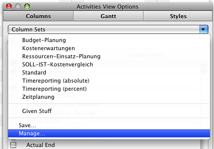
In Merlin you can save a set of columns that you can activate at any time you wish.
- Search and select the columns that you wish to group
- Click on the "Column Sets" popup menu and select "Save"
- Give the column set a name and define if it should be available for all projects or just for the current project.
You can also delete, modify or set-as-default any column set over the "Manage..." dialogue in the "Column Set" popup menu
You can define a custom title to be displayed instead of the predefined column names.
- Select the column you wish to give a custom title to
- Double click the area under the "Custom Title" column to edit its content
- Enter the title and press enter
- If you want, you can change the alignment of the title by choosing the desired alignment from the popup menu
Alignment applies to given title or custom titles
Besides using the style information it is possible to modify the Gantt chart with several different available options.
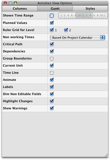
Merlin can use a different project working time to display the Gantt bars than the project calendar settings
As described in the Actual Values page, the bars in the Gantt chart are displayed in gray when actual values have been entered for an activity. Uncheck this option to disable it.
Depending on the amount set in the time scale, you will find one to four checkboxes here. With this option it is possible to display a gray line in the Gantt chart for each time scale. This could make it easier to read the Gantt chart of projects with multiple levels.
With this option you can decide if the non working time is displayed in gray in the Gantt chart. You can select whether the project calendar should define the working hours for all activities or each row should be handled individually. The non working time refer to the time defined in the project calendar.
With this option you can activate or deactivate the display of the critical path in the Gantt chart. The critical path plays an important role in many projects. The critical path concerns all activities in a project that cannot be automatically deferred to the left (=in the past) or to the right (=in the future) and that directly influence the project (for a detailed definition please read the article on Wikipedia).
With this option you can enable or disable the display of the dependency lines in the Gantt.
If you activate this option, the actual unit of the lowest time scale will be highlighted in light blue in the Gantt chart.
The time line function displays the current point of time with a vertical red line in the Gantt chart.
If you have this option activated you will notice that the changes you make in the Gantt chart are animated. This means that, for example, when you drag a bar, the actual dragging to the new position becomes visible. However, if you are working on an older Macintosh model, which does not have an powerful GPU, it might be a good idea to deactivate this option enhancing Merlins performance.
Activating this option displays all the labels in the Gantt chart (in front of, within and behind the bars).
When enabled, calculated values in the outline portion of the view will be displayed in dimmed color (gray). We recommend that you enable this option.
When enabled, directly and indirectly (due to calculations) fields will have their background change color to indicate changed values. We recommend that you enable this option.
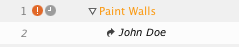
When enabled, warnings will be shown in the outline portion of the view as well as the resources well.
Besides using the style information it is possible to modify the Netplan in the "Net Plan" tab when applying various available options.
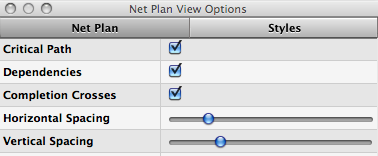
With this option you can enable or disable the display of the critical path in the Gantt. The critical path plays an important role in many projects. The critical path concerns all activities in a project that cannot be automatically deferred to the left (=in the past) or to the right (=in the future) and that directly influence the project (for a detailed definition please read the article on Wikipedia).
With this option you can activate or deactivate the dependency lines.
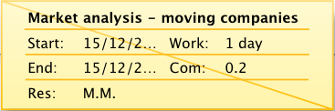
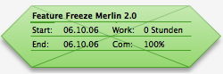
In a traditional PERT graph, and other graphs based on the Netplan method, it is often the case that an ongoing activity is displayed with a diagonal line within the box and then, upon completion, a second diagonal line is displayed (more information regarding this can be found on Wikipedia). It is possible to reproduce this behavior in Merlin by selecting this option.
Both of these options can be used to specify how much spacing should be displayed between the boxes horizontally and vertically.
When enabled, calculated values in the boxes will be displayed in dimmed color (gray).
When enabled, directly and indirectly (due to calculations) fields will have their background change color to indicate changed values. We recommend that you enabled this option.
When enabled, warnings will be shown in the resources well.
