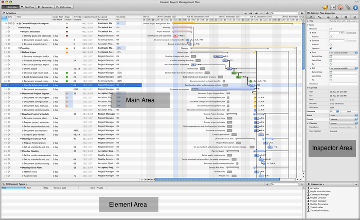
Merlin’s interface provides you with a main window, which displays all the tools and information you usually use. The main window is divided into four areas offering a large variety of information regarding the project outline, elements, resources and inspector.
In the menus you will find all the commands that can be used in Merlin. A keyboard shortcut exists for almost all the menu functions.
Four different views have been integrated into Merlin. Clicking on the desired view will bring that view into focus.

Depending on the view you have selected, the main area offers you different details and information about your project. You can view and in certain cases modify the main outline of your project, adding activities, groups and milestones. Furthermore, this area also allows you to work interactively with the Gantt chart, Netplan and resource utilization.
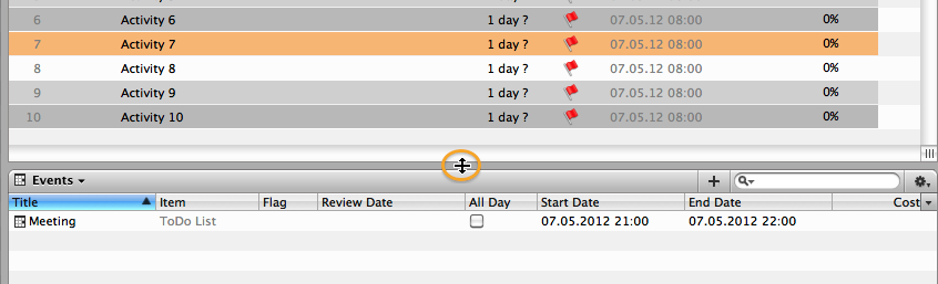
The Elements Area provides a collection point for all the information that is gathered prior to, during and after a project completion. With Merlin’s Element concept we have implemented a new type of functionality for project management software. Elements will provide you with a powerful and organized structure to store and document events, risks, checklists throughout your project. The Elements area is always situated below the main area and can be accessed using the F2 key.
The Inspector displays detailed information of the selected object.

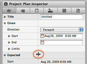
You can enter required information in the Inspector and obtain valuable data for your project. Right clicking on an empty gray area in the Inspector will display a context menu, in which you can switch between small and large inspector controls. You will also find the setting for this option in the Preferences.
Can be shown or hidden by a tool bar button or the corresponding menu command; Window - Show/Hide Info Area. More Info…
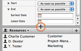
This area provides you with two different types of contents. A list of resources or grops that can be assigned to activiies. In addition, you can add your Address Book resources to Merlin by dragging and dropping the resources into this dialog.

The second type of content displayed in this area is project conflicts. When a conflict is selected from this list, Merlin highlights the corresponding activity in the main view.
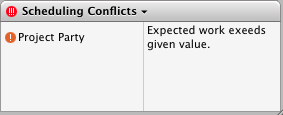
Adjust the column separator for additional space for the activities or the described conflicts/warnings
Merlin's toolbar is global to the entire application. You can edit the tool bar icons by right-clicking anywhere on the tool bar itself and choosing "Customize Toolbar...". In addition to the view selector buttons, Merlin's tool bar has additional buttons described below:
This is the Project Settings icon. It can also be accessed using the Main Menu at "File - Project Settings".
This is the Library icon. Pressing it will show the Library. It can also be accessed using the Main Menu at "Window - Library."
This tool bar button will show/hide the Element section. Alternatively, the Element section can be accessed over the menu "Window - Show Elements."
This tool bar button is used to show/hide the inspector. The corresponding menu command for this is "Window - Show/Hide Info Area". More Info…
 This tool bar button is used to toggle Merlin's publishing mode on or off. The corresponding menu command for this is "File - Publish".
Each view has an additional toolbar - the so-called feature bar. On this bar you will find the functions that are important for that specific view. Each feature bar is developed according to the same design. On the left side you will find the title of the view with its icon; On the right side, the functions used for this view. Unlike the main toolbar, it is not possible to modify these feature bars


The dimensions of each section in Merlin can be modified using the gray separators between each section. For example, if you would like to increase the height of the additional area section in the
Furthermore the
You can show/hide the Gantt chart in the Activities and Utilization views by sliding the Gantt resizer button found on the bottom edge.


